Andee PXT Package For Makecode
All blocks found in the PXT package can be found here. The blocks will be separated from basic and advanced blocks.
The package uses a namespace called Andee and has a class called widget. Creating a widget requires instantiating the class. However this only applies to users who use the javascript tab.
Basic Blocks
These blocks are in the first page of the Andee package. Thses functions are needed to create the widgets.
Begin
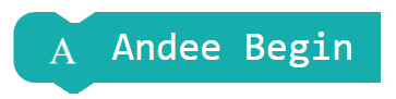
Andee.begin()
This block is required on start to enable the use of the Andee widgets
Create Widget
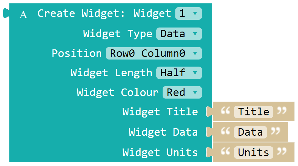
let widget1 = Andee.createWidget(id,type,position,length,color,title,data,units)
This function creates a new widget to display on the Andee app. Due to the limited memory in the microbit, only 5 widgets can be created at a time.
The arguments require the use of several enumerators when using the javascript function. Use the arguments below to make the widget
id uses an enumerator WidgetId.
enum WidgetId {
Widget_1, Widget_2, Widget_3, Widget_4, Widget_5
}
type uses an enumerator WidgetType
enum WidgetType {
Databox, Databox_Circle, Databox_Header, Button, Button_Circle, Keyboard_In
}
position uses an enumerator WidgetPosition
enum WidgetPosition {
Row0_Column0, Row0_Column1, Row0_Column2, Row0_Column3,

Row1_Column0, Row1_Column1, Row1_Column2, Row1_Column3,

Row2_Column0, Row2_Column1, Row2_Column2, Row2_Column3,

Row3_Column0, Row3_Column1, Row3_Column2, Row3_Column3
}
Each row and column represents the smartdevice screen. For example, if the user wants the widget to be at the top right corner of the screen, use WidgetPosition.Row0_Column3
length uses an enumerator WidgetLength
enum WidgetLength {
One_Quarter, Half, Full
}
Quarteris approximately 1 quarter of the length of the screenHalfis approximately 1 half of the length of the screenFullis approximately 1 length of the screen
color uses an enumerator WidgetColor
enum WidgetColour {
Red, Dark_Red, Orange, Dark_Orange,
Yellow, Dark_Yellow, Green, Dark_Green,
Blue, Dark_Blue, Indigo, Dark_Magenta,
Magenta, Violet
}
title,data and units only accept a String. If not needed, these 3 arguments can be left empty.
Create Slider/Analog Circle Widget
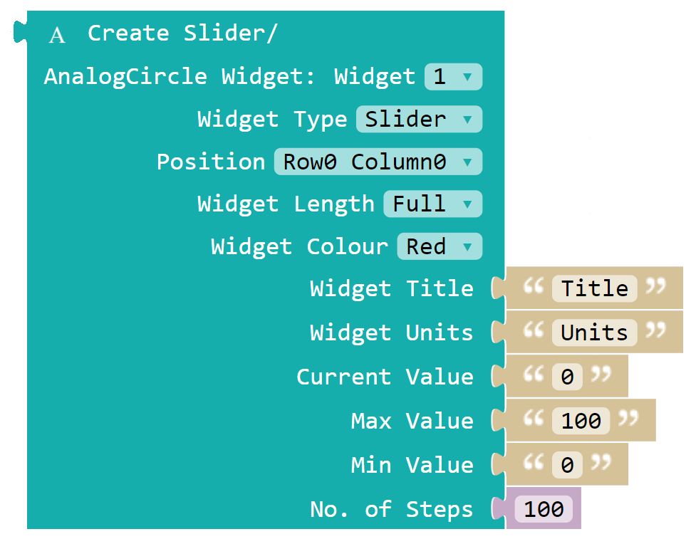
let widget1 = Andee.createSliderWidget(id,type,position,length,color,title,data,units)
This function creates a new slider or analog circle widget to display on the Andee app. Due to the limited memory in the microbit, only 5 widgets can be created at a time.
The arguments require the use of several enumerators when using the javascript function. Use the arguments below to make the widget
id uses an enumerator WidgetId.
enum WidgetId {
Widget_1, Widget_2, Widget_3, Widget_4, Widget_5
}
type uses an enumerator WidgetType
enum WidgetTypeInput {
Slider, Analog_Dial
}
position uses an enumerator WidgetPosition
enum WidgetPosition {
Row0_Column0, Row0_Column1, Row0_Column2, Row0_Column3,

Row1_Column0, Row1_Column1, Row1_Column2, Row1_Column3,

Row2_Column0, Row2_Column1, Row2_Column2, Row2_Column3,

Row3_Column0, Row3_Column1, Row3_Column2, Row3_Column3
}
Each row and column represents the smartdevice screen. For example, if the user wants the widget to be at the top right corner of the screen, use WidgetPosition.Row0_Column3
length uses an enumerator WidgetLength
enum WidgetLength {
One_Quarter, Half, Full
}
Quarteris approximately 1 quarter of the length of the screenHalfis approximately 1 half of the length of the screenFullis approximately 1 length of the screen
color uses an enumerator WidgetColor
enum WidgetColour {
Red, Dark_Red, Orange, Dark_Orange,
Yellow, Dark_Yellow, Green, Dark_Green,
Blue, Dark_Blue, Indigo, Dark_Magenta,
Magenta, Violet
}
title,data and units only accept a String. If not needed, these 3 arguments can be left empty.
Update Widget

class update()
This function will make the widget appear on the screen of the connected device. This function has to be called each time a widget property is changed to reflect the new change
Remove Widget
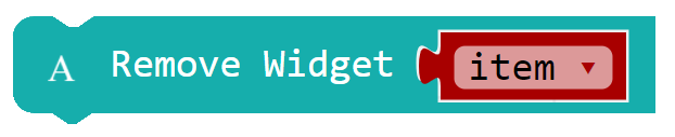
class remove()
This function removes the widget from the screen of the connected device
Clear Screen
Andee.clear()
This function clears the screen of the Andee app, removing all widgets on it
Get Keyboard Reply
let replyString = Andee.getKeyboard()
This function returns the string that the user inputs in the keyboard widget on the Andee app. This function should be used in the widget event
Get Slider Value
let replyNum = Andee.getSlider()
This function returns the value of the slider widget on the Andee app. This function should be used in the widget event
Widget Events
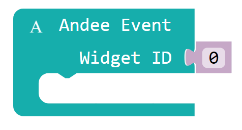
Andee.WidgetEvent(widgetId,actions)
This function creates an event for input based widgets like buttons,sliders and keyboard widget.
widgetId uses an enumerator WidgetId
- Widget_1
- Widget_2
- Widget_3
- Widget_4
- Widget_5
Place the functions to be called in actions which will be done when the event is fired.
Example
Andee.WidgetEvent(WidgetId.Widget_1, () => {
let reply = Andee.getKeyboard()//reply will store the string from the widget and can now be used
})
Convert Number to String

let sendString = Andee.convertNumberToString(value)
This function converts a number and returns a string.
value is a Number
Advanced Blocks
These blocks are in the second page of the Andee package. Not all the blocks here are needed to create widgets. Most of the bloacks are to change certain properties of the widget. This will be helpful when the user needs to change the colour of a widget during runtime for example.
Note: Make sure to always call update() for a widget after changing its properties or else the changes will not show in the app
Set Title

class setTitle(title)
This function changes the title of the widget.
title is a String
Set Data

class setData(data)
This function changes the data of the widget.
data is a String
Set Units
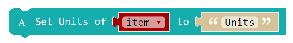
class setUnit(units)
This function changes the units of the widget.
units is a String
Set Button Mode
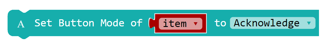
class setButtonInputMode(buttonMode)
This function sets the button widget to 2 different modes.
buttonMode accepts an enumerator ButtonMode
enum ButtonMode {
Acknowledge, MultiPress
}
Acknowledgemode makes the button require an acknowledgement after a button press. User will need to sendack()to allow the button to be pressed again.MultiPressis the default mode of the button widget. This allows the user to press the button as many times as possible
Set Keyboard Mode
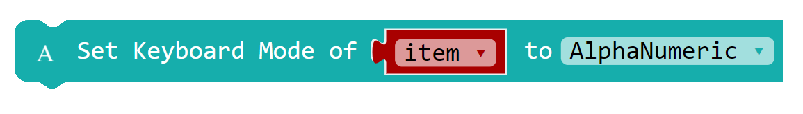
class setKeyboardInputMode(kbMode)
This function sets the keyboard widget to one of the 4 possible modes
kbMode accepts an enumerator KeyboardMode
enum KeyboardMode {
AlphaNumeric, AlphaNumeric_PW, Numeric, Numeric_PW
}
AlphaNumericis the default mode of the keyboard widget. This mode sets the keyboard on the widget to the AlphaNumeric keyboardAlphaNumeric_PWmode sets the keyboard on the widget to AlphaNumeric and also hides the typed keys after a few secondsNumericmode sets the keyboard on the widget to the Numeric keyboardNumeric_PWmode sets the keyboard on the widget to Numeric and also hides the typed keys after a few seconds
Set Slider Mode
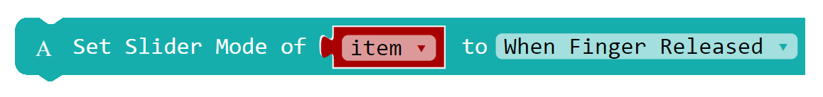
class setSliderInputMode(sliderMode)
This function sets the slider widget to one of the 3 possible modes
sliderMode accepts an enumerator SliderMode
enum SliderMode {
On_Finger_Release, On_Value_Change, No_Thumb_Slider
}
On_Finger_Releaseis the default mode of the slider widget. This mode will send back the updated value of the slider when the user releases the slider thumbOn_Value_Changemode will send back the updated value of the slider every time the slider thumb movesNo_Thumb_Slidermode will remove the slider thumb so that the user can use the slider widget like a progress bar
Set X Coordinate of Widget
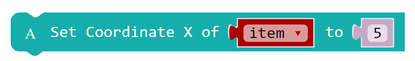
class setCoordX(xCoord)
This function sets the X coordinate of the widget. This allows the user to finely tune the position of the widget.
xCoord is a Number
Note: The widget's origin is at the top left hand corner so the length and width of the widget have to be calculated properly to prevent it from overlapping other widgets
Set Y Coordinate of Widget
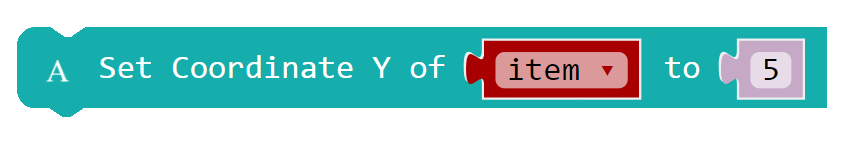
class setCoordY(yCoord)
This function sets the Y coordinate of the widget. This allows the user to finely tune the position of the widget.
yCoord is a Number
Note: The widget's origin is at the top left hand corner so the length and width of the widget have to be calculated properly to prevent it from overlapping other widgets
Set Widget Width
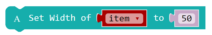
class setWidth(width)
This function sets the width of the widget.
width is a Number
Note: Make sure to change the x and y coordinates of the widget if it overlaps another widget
Set Widget Height

class setHeight(height)
This function sets the height of the widget.
height is a Number
Note: Make sure to change the x and y coordinates of the widget if it overlaps another widget
Set Widget Colour

class setColour(color)
This function changes the colour of the widget. Select from the available colours in the enumerator WidgetColour
enum WidgetColour {
Red, Dark_Red,
Orange, Dark_Orange,
Yellow, Dark_Yellow,
Green, Dark_Green,
Blue, Dark_Blue,
Indigo, Dark_Magenta,
Magenta, Violet,
}
Update Widget after X Loops
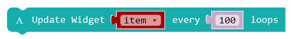
class updateLoop(loops)
This function changes the amount of loops needed to lapse before sending the update BLE packet to the app. Constantly sending update packets to the connected device will slow down both the app and the microbit. Pausing the program is also inefficient due to blocking. Hence, by sending the update packets after some loops, the BLE is not overcrowded and the microbit can continue doing its other functions properly.
loops is a Number
Send Acknowledgement

class ack()
This function sends an acknowledgement to the Andee app when this function is called. Call this function when using a button widget that is in acknowledge mode. When the device receives this packet, ti will release the corresponding button so that the user can tap it again
Force a Widget to Update
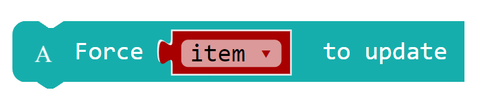
class forceUpdate()
This function forces a widget to update when called. Useful when changes to a widget is made during runtime. Due to the nature of the widget updates, the widget might take several lops before updating. For the change to reflect on the app the fastest, call this function